Recently, Lenz’s Creative Director Scott Sanders provided a new visual identity and accompanying merchandise for the Brick Store Pub’s new Beer Garden concept. The Brickstore Pub is a longstanding Decatur restaurant (and neighbor of Lenz Marketing) and is well known for its unique old-world European atmosphere and extensive beer offerings.
“Scott Sanders has been doing design work for my company for the last several years. He has a great eye and has proven to be a great partner in creating our brand through design and marketing. He has the ability to design what I want, but also has a keen ability to help me get to what I’m looking for.”
Dave Blanchard, Brickstore Pub Co-Owner
Hear about the work firsthand from Scott himself! Below is his recounting of the project:
I started working at Lenz in 2002. The Lenz office is next door to the Brick Store Pub. The cozy pub was a great place to decompress from work, and our clients would frequently request meetings at the Brick Store. We became friends with the owners as the pub became a second office for Lenz.
In 2005, my old pal Dave Blanchard asked me if I could design something that captures the spirit and character of the Brick Store Pub. After a couple of proper pints of Guinness and a hug from Dave, I agreed to take on the project. Dave and I have been “two peas in a pub” ever since.
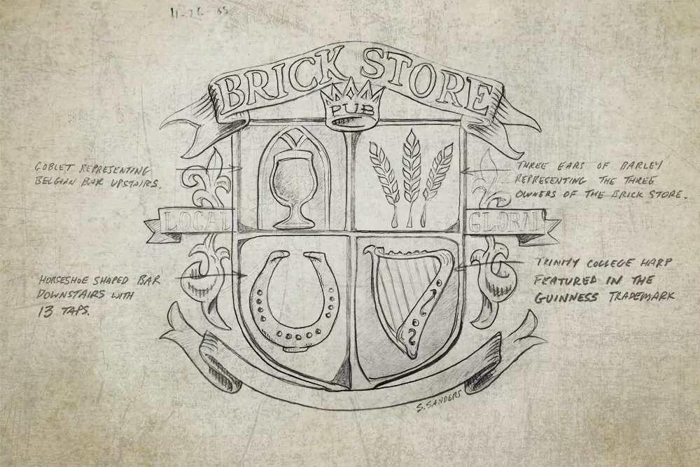
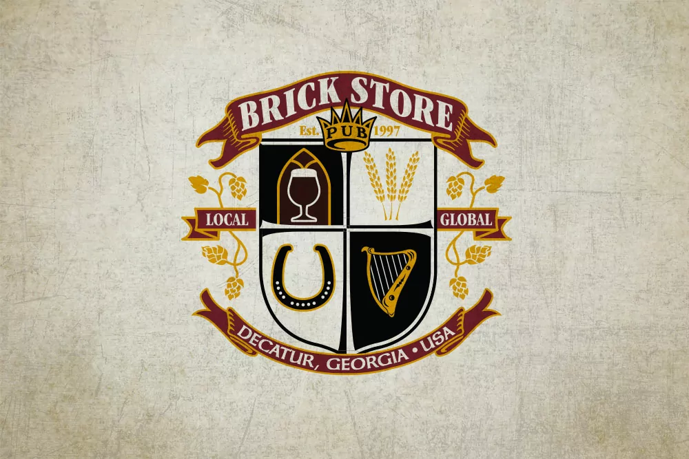
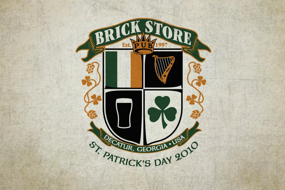
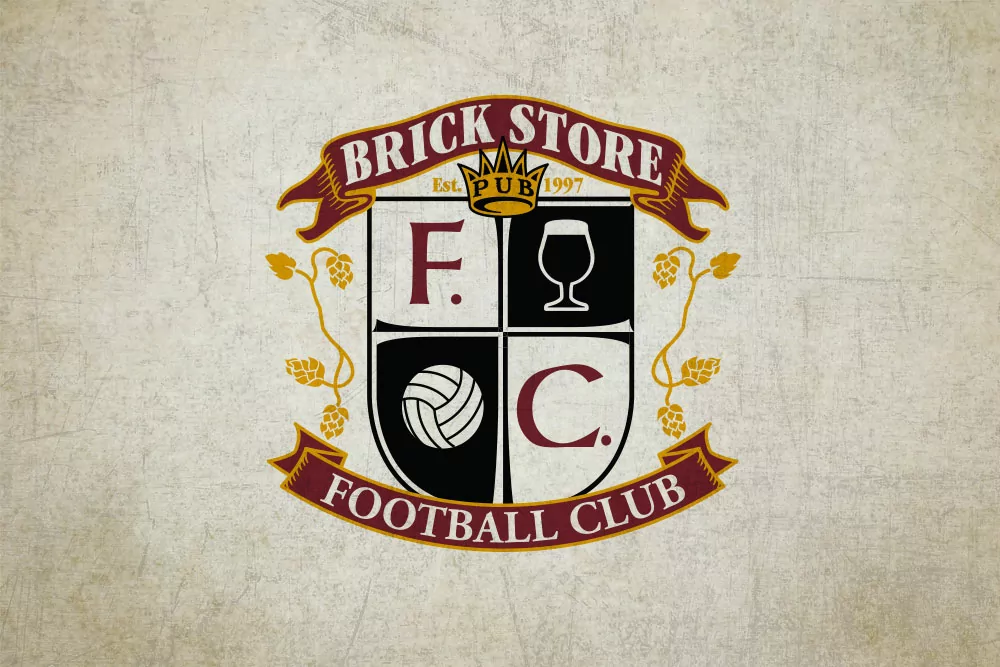
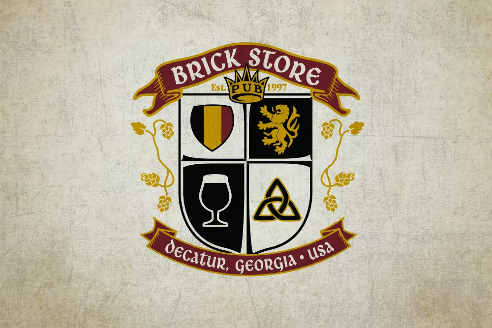
After I drank my Guinness, I brewed up a few sketches and landed on a crest or coat of arms that had 4 quadrants. Each quadrant represented an element of the pub. One quadrant featured a pint of Guinness, and one quadrant was a horseshoe representing the shape of the bar downstairs, etc. The crest has evolved as the pub has grown and matured. There is even a version of the crest for the Brick Store Football (soccer) Club and a St. Patrick’s Day crest. It has been a design cornerstone of the Brick Store visuals over the years.
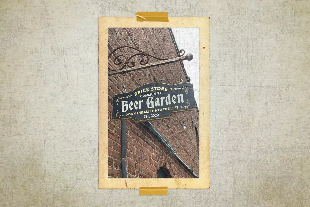
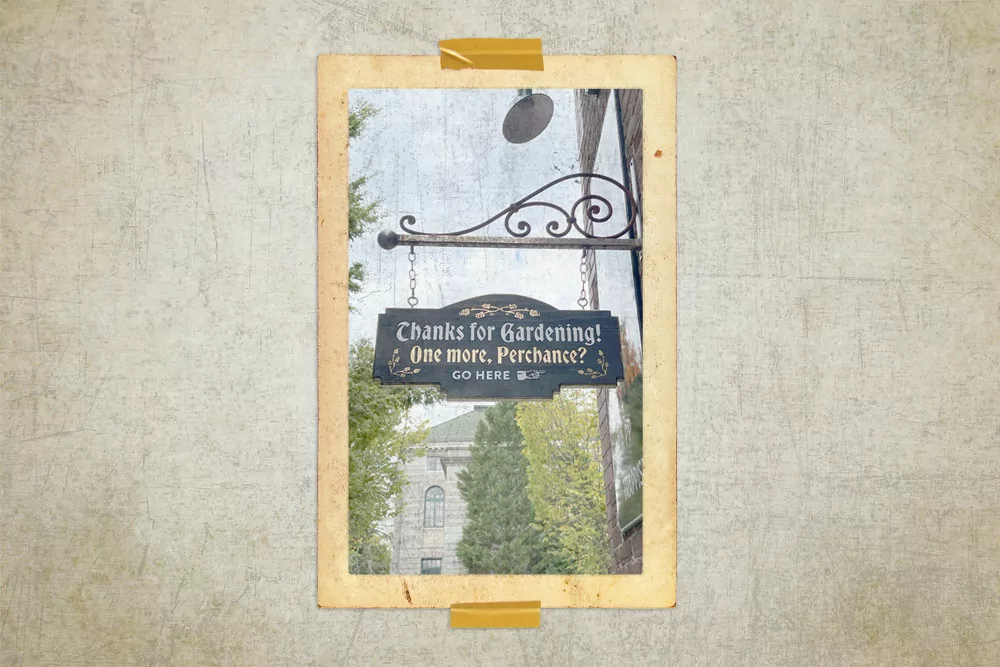
This year, Dave approached me to design a brand for the Beer Garden which opened during Covid in 2020 to give people a cozy place to safely eat and drink al fresco. The garden has a German vibe, so I landed on a Gothic blackletter typeface that originates from the 11th and 12th centuries in northern Europe. The gothic lettering and the hop motif from the crest resulted in a unique design that still retains the Brick Store character. The first application of the design was an outdoor sign that directs patrons to go “Down the Alley and to the Left” which is where the garden is located, of course. In a rare moment of brilliance, I told Dave that we should use gold leaf on the sign to give it a medieval illuminated manuscript quality. He said “Great Scott! Let’s do it!”, and he hired the supremely talented Josh Jameson to fabricate, gold leaf, and hand paint the sign. He did a fantastic job.
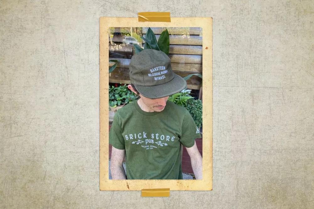
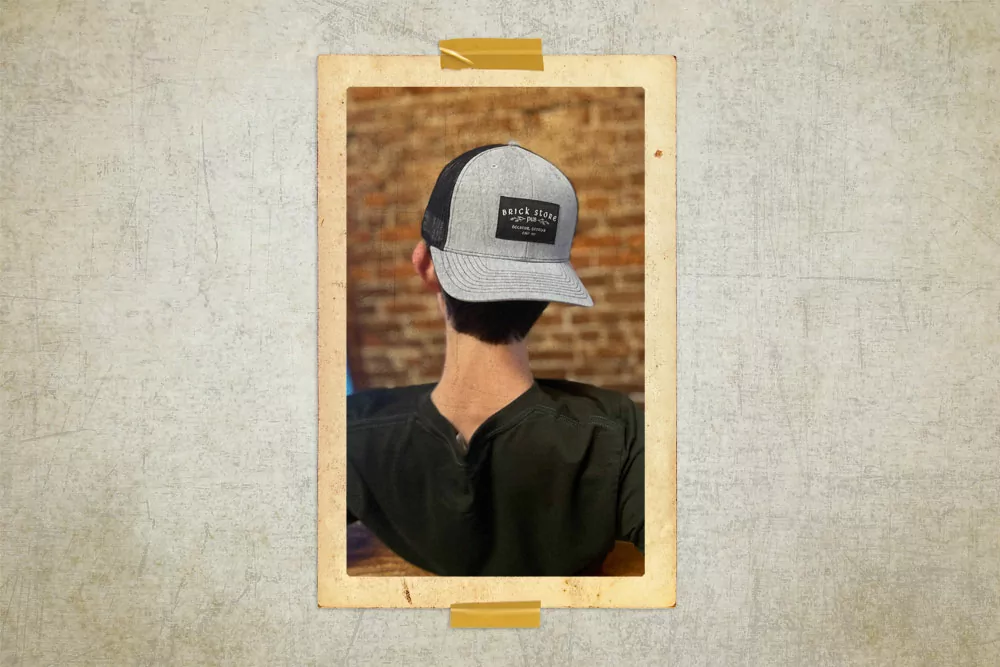
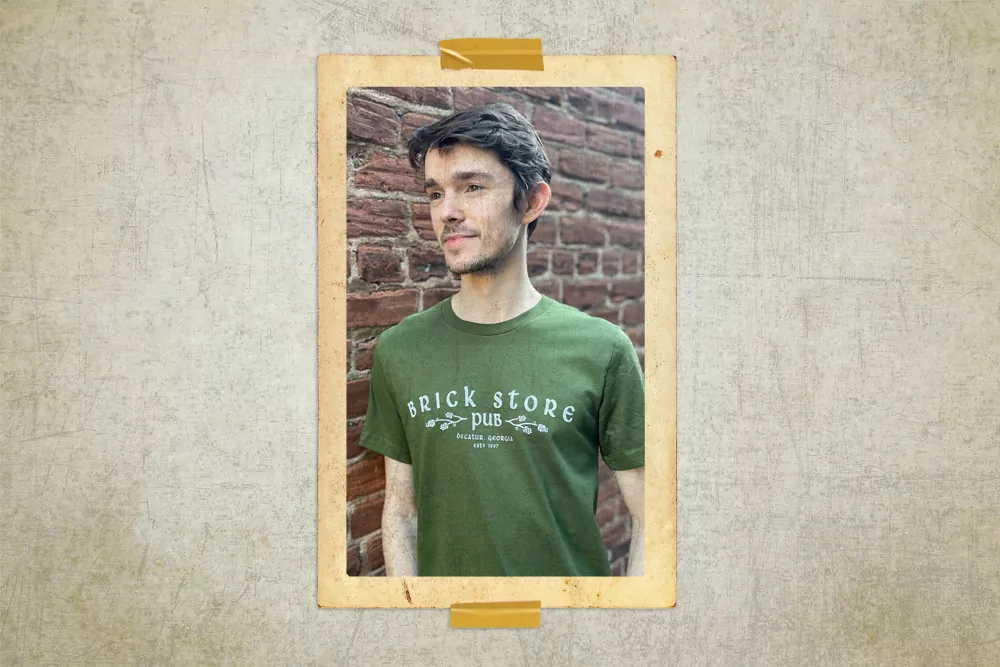
In addition, the Brick Store needed new shirt and hat designs. He wanted simple and timeless designs that reflected the Brick Store brand. One of the shirts is a general Brick Store shirt, Dave and I thought it would be a good idea if we only used the typeface and the hop design motif used in the crest.
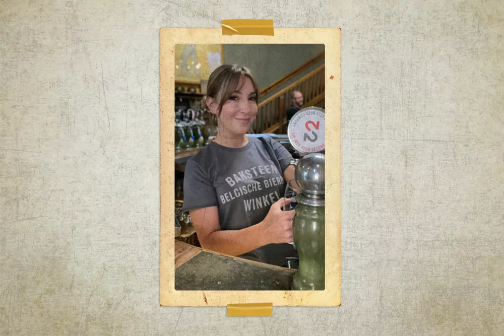
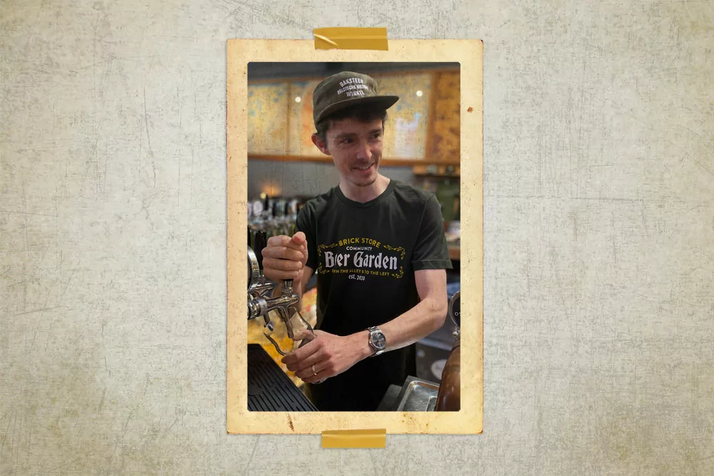
And last, but not least, are the designs for the Brick Store Belgian Bar which opened in 2004. This was the first design that featured the Belgian bar on merchandise, and we decided to create a Baksteen Winkel brand for the shirts and hats. (Baksteen Winkel means Brick Store in Dutch.) We gave the Belgian Bar an identity that complements the Brick Store’s aesthetic as well. The design is bold, simple, and modern.
It has been a pleasure to work with the Brick Store and to work at Lenz for over 2 decades. I’m grateful that both of these visionary companies have trusted me to create memorable designs and brands that (I hope) stand the test of time. Let’s raise a pint to them. Sláinte and One Love!
Interested in a unique brand identity for your company? Reach out to Lenz to see what design thoughts we’re sipping on!