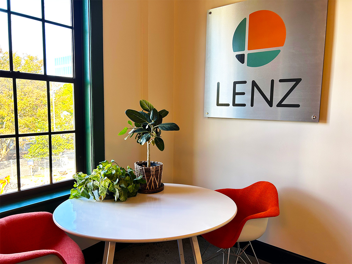
Lenz is proud to unveil our new logo, designed to honor our past, present, and future—as well as our new home.
Retained from the original mark, created in the early 1990s, are the circular form, the color orange, and of course the company name.
But careful observers will notice a softer orange, a rounded, more contemporary type treatment, and a number of changes to the icon—including the introduction of a secondary brand color, a green hue.
Imagined and designed by Scott Sanders, with vital contributions by Stephen Lacienski and Christine Mahin, the logo’s new orange was inspired by what one artist described as the color of sunset resting on Ebenezer Baptist Church, the iconic place of worship where Martin Luther King, Jr. stood pastor and perfected his singular oratory style.
The introduction of green is inspired by the original colors of the rafters in our new home, here at 545 N. McDonough, which we uncovered while opening up the space in pursuit of its history and century-old beauty.
And finally, the cross section that defines the icon is intended to represent Lenz’s eternal connection to Decatur, which has been our home for decades—and always will be. Look closely and you’ll see the downtown square, including our new office, at lower left; our former 119 East Court Square location (in orange) at the upper right; room at the upper left honoring the Historic Decatur Courthouse and new John Lewis statue; and both the MARTA line and row of restaurants that line the the former Sycamore Street at the lower right.
We are proud to call Decatur home and hope that our new visual identity honors it as we intend.


